class: center, middle, inverse, title-slide .title[ # Visualising data ] .subtitle[ ## <br><br> Introduction to Data Science ] .author[ ### University of Edinburgh ] .date[ ### <br> 2025/2026 ] --- ## The story so far... - **Data** are observations or measurements (unprocessed or processed) of various data types: numbers, characters, factors, dates, etc. - A **dataset** is a structured collection of data associated with a unique body of work. - Majority of datasets are structured in a 'tidy' tabular/rectangular form where: - Each row is an **observation** - Each column is a **variable** --- ## The story so far... It may be necessary to clean and **wrangle** the dataset in preparation for analysis by... - Extracting: `select()` and `filter()` - Ordering: `arrange()` - Transforming: `mutate()` - Combine: `left_join()`, `right_join()` and `full_join()` - Arrangement: `pivot_wide()` and `pivot_long()` Then the cleaned data is **summarised** for investigation and communication via... - Grouping: `group_by()` - Tabulation: `count()` - Summarising: `summarise()` - `sum()`, `n()` - `mean()`, `var()`, `sd()`, `cor()` - `median()`, `min()`, `max()`, `quantile()`, `IQR()` --- class: middle # Exploratory data analysis --- ## What is EDA? - Exploratory data analysis (EDA) is the first step in **understanding** the main features and structures of a data set. <br> - Many statistical tools and techniques are used when performing EDA, but crucially they are **simple** to allow the data __speak__ for itself. <br> - Tools that a data scientist may use are: - Data transformation/wrangling - Calculation of simple summary statistics (mean, median, variance, correlation, etc.) - Tabulation - Graphical or visual representations - etc. > *"Although we often hear that data speak for themselves, their voices can be soft and sly." --- Mosteller et al. (1983)* --- ## Common statistics .panelset[ .panel[.panel-name[Measures of location] .pull-left[ * **Mean** <span style="color: red;">■</span>: The averaged value, data's centre of mass `$$\bar{x} = \frac{1}{n}\sum_{i=1}^n x_i$$` * **Median** <span style="color: green;">■</span>: The mid-point that splits the data in a lower 50% and an upper 50%. * **Mode** <span style="color: blue;">■</span>: The most frequent/likely value. ] .pull-right[ <img src="w05-L10_files/figure-html/location-1.png" style="display: block; margin: auto;" /> .small[ Note: Skewness indicates the direction of the longer tail. ] ] ] .panel[.panel-name[Measures of spread] .pull-left[ * **Standard deviation**: How far, on average, the data is from the mean. `\(s = \sqrt{\frac{1}{n-1}\sum_{i=1}^n (x_i-\bar{x})^2}\)` 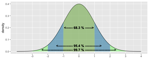<!-- --> ] .pull-right[ * **Inter-quartile range**: The width of the middle 50% of the data. `\(IQR = Q_3 - Q_1\phantom{s = \sqrt{\frac{1}{n-1}\sum_{i=1}^n (x_i-\bar{x})^2}}\)` 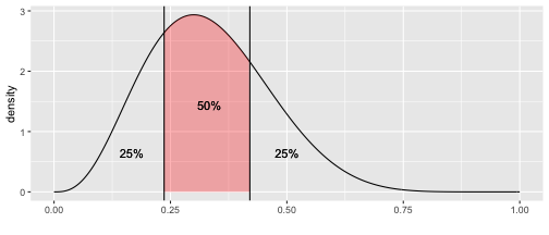<!-- --> ] ] .panel[.panel-name[Measure of dependence] .pull-left[ * **Correlation**: The degree of _linear_ dependence between two variables. ] .pull-right[ `\(r = \frac{\sum_{i=1}^n (x_i - \bar{x})(y_i - \bar{y})}{\sqrt{\sum_{i=1}^n (x_i - \bar{x})^2}\sqrt{\sum_{i=1}^n (y_i - \bar{y})^2}}\)` ] <!-- --> ] ] --- ## Simulated example .panelset[ .panel[.panel-name[Data] * File `simulated_datasets.csv` contains two sets of data, labelled `"A"` and `"B"` * Each data set consists 1000 samples of two numerical variables, `x` and `y`. ``` r data <- read_csv("data/simulated_datasets.csv") ``` .pull-left[ ``` r data %>% filter(set == "A") %>% head(n = 3) ``` ``` ## # A tibble: 3 × 4 ## set id x y ## <chr> <dbl> <dbl> <dbl> ## 1 A 1 52.6 32.7 ## 2 A 2 52.5 38.8 ## 3 A 3 52.4 33.0 ``` ] .pull-right[ ``` r data %>% filter(set == "B") %>% head(n = 3) ``` ``` ## # A tibble: 3 × 4 ## set id x y ## <chr> <dbl> <dbl> <dbl> ## 1 B 1 52.4 32.7 ## 2 B 2 55.4 35.2 ## 3 B 3 56.0 35.2 ``` ] ] .panel[.panel-name[Statistics] ``` r data %>% group_by(set) %>% summarise( avg_x = mean(x), sd_x = sd(x), med_x = median(x), min_x = min(x), max_x = max(x), IQR_x = IQR(x), avg_y = mean(y), sd_y = sd(y), med_y = median(y), min_y = min(y), max_y = max(y), IQR_y = IQR(y), cor_xy = cor(x, y) ) ``` ``` ## # A tibble: 2 × 14 ## set avg_x sd_x med_x min_x max_x IQR_x avg_y sd_y med_y min_y max_y IQR_y cor_xy ## <chr> <dbl> <dbl> <dbl> <dbl> <dbl> <dbl> <dbl> <dbl> <dbl> <dbl> <dbl> <dbl> <dbl> ## 1 A 52.4 3.32 52.4 43.9 60.9 5.96 32.7 2.39 32.7 26.6 38.8 4.27 -0.000537 ## 2 B 52.4 3.32 52.4 43.9 60.9 5.96 32.7 2.39 32.7 26.6 38.8 4.27 -0.000657 ``` ] .panel[.panel-name[Histogram of `x`] .pull-left[ ``` r ggplot(data, mapping = aes(x = x, fill = set)) + geom_histogram(bins = 30) + facet_wrap(~set) ``` ] .pull-right[ 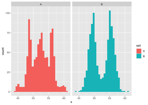<!-- --> ] ] .panel[.panel-name[Scatterplot of `x` & `y`] .pull-left[ ``` r ggplot(data, mapping = aes(x = x, y = y, col = set)) + geom_point() + facet_wrap(~set) ``` ] .pull-right[ 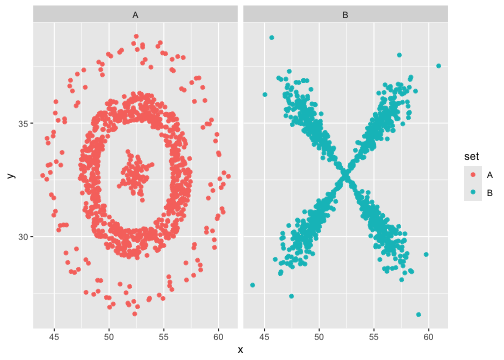<!-- --> ] ] ] --- class: middle # Data visualization --- ## Data visualization > *"The simple graph has brought more information to the data analyst's mind than any other device." --- John Tukey* - Data visualization is the creation and study of the visual representation of data. - The purpose is to literally *see* what your data seems to say. - Human brains are very good at identifying complex patterns ... - ... and similarly they can easily be fooled! - Visualising the data can help identify unusual shapes and structures that are not intuitive and difficult to examine numerically. --- ## Example: RANDU - Pseudo-random number generators are algorithms that generate a sequence of numbers that satisfy important statistical properties of randomness. - **Randu** was a popular algorithm for generating random numbers in 1960s & 1970s. - Numbers are generated via the recursion: `$$V_{j+1} = (65539~ V_j) \mod 2^{31}$$` - Typically, these numbers are scaled to the `\([0, 1]\)` interval: `\(X_j = V_j / 2^{31}\)`. - **Question**: What are the desired properties you want from (uniform) random numbers? --- ## Example: RANDU plots .pull-left[ 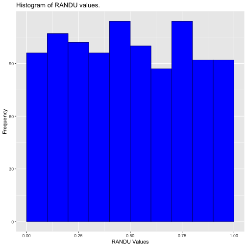<!-- --> ] .pull-right[ 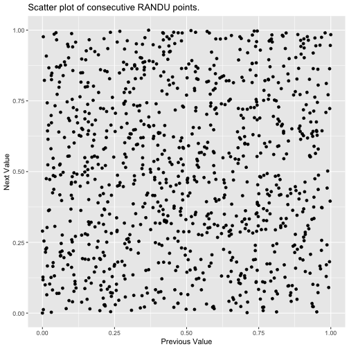<!-- --> ] --- ## Example: RANDU * But, if we create a 3D scatter plot with three consecutive RANDU values and rotate ... <img src="img/3dRANDUAnimation_loop.gif" width="40%" style="display: block; margin: auto;" /> * Use visualisations to **explore** the data. You may need more than one perspective. --- ## Example: Facebook visits .question[ How many times do you go on Facebook per day? ] .pull-left[ 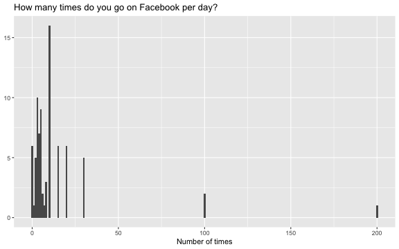<!-- --> ] .pull-right[ - What insights does this plot give about: - how frequent participants are viewing Facebook? - how the participants are answering the question? ] - You may need to iterate between visualisation and data transform. --- ## The good, the bad and the ugly 🤠 * Not all data visualisations are designed equally in their informativeness. <img src="img/good_bad_ugly_plots.png" width="100%" style="display: block; margin: auto;" /> * Be cautions of data visualisations that are designed to mislead! 👿 --- ## The Four respects: 1. **Respect the people** - Who are the target audience? - Respect users perception and cognitive capabilities. - Is your visualisation inclusive? 2. **Respect the data** - Let the data speak for itself! - Use an appropriate visualisation style for the data type. - Don't "massage" the data for a particular narrative. - Use an informative title and axis labels. 3. **Respect the mathematics** - Use of appropriateness geometric attribute (eg, length vs area) - Is the geometry of the visualisation correct? - Scale and range of the axes. 4. **Respect the computers** - Don't overtax the computer --- class: middle # ggplot2 --- ## ggplot2 `\(\in\)` tidyverse .pull-left[ <img src="img/ggplot2-part-of-tidyverse.png" width="80%" /> ] .pull-right[ - **ggplot2** is tidyverse's data visualization package - `gg` in "ggplot2" stands for *Grammar of Graphics* from the book by Leland Wilkinson <img src="img/grammar-of-graphics.png" width="100%" /> ] --- ## Structure of creating a plot - `ggplot()` is the main function in ggplot2 - Construct plots by _adding_ (`+`) layers -- **Not** the `%>%` pipe! - Structure of the code for plots can be summarized as: ``` r ggplot(data = [dataset], # Data mapping = aes(x = [x-variable], y = [y-variable])) + # Aesthetics geom_[*]() + # Geometries other options # ... ``` - Many types of geometries: - `geom_points()`, `geom_histogram()`, `geom_line()`, `geom_boxplot()`, etc. - [ggplot2 cheat sheet](https://www.rstudio.com/resources/cheatsheets/) --- ## Example: Palmer Penguins Measurements for penguin species, island in Palmer Archipelago, size (flipper length, body mass, bill dimensions), and sex. .pull-left-narrow[ <img src="img/penguins.png" width="80%" /> ] .pull-right-wide[ ``` r library(palmerpenguins) penguins ``` .small[ ``` ## ## Attaching package: 'palmerpenguins' ``` ``` ## The following objects are masked from 'package:datasets': ## ## penguins, penguins_raw ``` ``` ## # A tibble: 344 × 8 ## species island bill_length_mm bill_depth_mm flipper_length_mm body_mass_g ## <fct> <fct> <dbl> <dbl> <int> <int> ## 1 Adelie Torgersen 39.1 18.7 181 3750 ## 2 Adelie Torgersen 39.5 17.4 186 3800 ## 3 Adelie Torgersen 40.3 18 195 3250 ## 4 Adelie Torgersen NA NA NA NA ## 5 Adelie Torgersen 36.7 19.3 193 3450 ## 6 Adelie Torgersen 39.3 20.6 190 3650 ## 7 Adelie Torgersen 38.9 17.8 181 3625 ## 8 Adelie Torgersen 39.2 19.6 195 4675 ## 9 Adelie Torgersen 34.1 18.1 193 3475 ## 10 Adelie Torgersen 42 20.2 190 4250 ## # ℹ 334 more rows ## # ℹ 2 more variables: sex <fct>, year <int> ``` ] ] --- ## Example: Penguins dataset <img src="w05-L10_files/figure-html/penguins-1.png" width="50%" style="display: block; margin: auto;" /> --- ## Coding narative .midi[ > **Start with the `penguins` data frame,** > map bill depth to the x-axis > and map bill length to the y-axis. > Represent each observation with a point > and map species to the colour of each point. > Title the plot "Penguin bill depth & length", > label the x and y axes as "Bill depth (mm)" and "Bill length (mm)", respectively, > and label the legend "Species". ] .pull-left[ ``` r *ggplot(data = penguins) ``` ] .pull-right[ <img src="w05-L10_files/figure-html/unnamed-chunk-11-1.png" width="80%" /> ] --- ## Coding narative .midi[ > Start with the `penguins` data frame, > **map bill depth to the x-axis** > and map bill length to the y-axis. > Represent each observation with a point > and map species to the colour of each point. > Title the plot "Penguin bill depth & length", > label the x and y axes as "Bill depth (mm)" and "Bill length (mm)", respectively, > and label the legend "Species". ] .pull-left[ ``` r ggplot(data = penguins, * mapping = aes(x = bill_depth_mm)) ``` ] .pull-right[ <img src="w05-L10_files/figure-html/unnamed-chunk-12-1.png" width="80%" /> ] --- ## Coding narative .midi[ > Start with the `penguins` data frame, > map bill depth to the x-axis > **and map bill length to the y-axis.** > Represent each observation with a point > and map species to the colour of each point. > Title the plot "Penguin bill depth & length", > label the x and y axes as "Bill depth (mm)" and "Bill length (mm)", respectively, > and label the legend "Species". ] .pull-left[ ``` r ggplot(data = penguins, mapping = aes(x = bill_depth_mm, * y = bill_length_mm)) ``` ] .pull-right[ <img src="w05-L10_files/figure-html/unnamed-chunk-13-1.png" width="80%" /> ] --- ## Coding narative .midi[ > Start with the `penguins` data frame, > map bill depth to the x-axis > and map bill length to the y-axis. > **Represent each observation with a point** > and map species to the colour of each point. > Title the plot "Penguin bill depth & length", > label the x and y axes as "Bill depth (mm)" and "Bill length (mm)", respectively, > and label the legend "Species". ] .pull-left[ ``` r ggplot(data = penguins, mapping = aes(x = bill_depth_mm, y = bill_length_mm)) + * geom_point() ``` ] .pull-right[ <img src="w05-L10_files/figure-html/unnamed-chunk-14-1.png" width="80%" /> ] --- ## Coding narative .midi[ > Start with the `penguins` data frame, > map bill depth to the x-axis > and map bill length to the y-axis. > Represent each observation with a point > **and map species to the colour of each point.** > Title the plot "Penguin bill depth & length", > label the x and y axes as "Bill depth (mm)" and "Bill length (mm)", respectively, > and label the legend "Species". ] .pull-left[ ``` r ggplot(data = penguins, mapping = aes(x = bill_depth_mm, y = bill_length_mm, * colour = species)) + geom_point() ``` ] .pull-right[ <img src="w05-L10_files/figure-html/unnamed-chunk-15-1.png" width="80%" /> ] --- ## Coding narative .midi[ > Start with the `penguins` data frame, > map bill depth to the x-axis > and map bill length to the y-axis. > Represent each observation with a point > and map species to the colour of each point. > **Title the plot "Penguin bill depth & length", ** > label the x and y axes as "Bill depth (mm)" and "Bill length (mm)", respectively, > and label the legend "Species". ] .pull-left[ ``` r ggplot(data = penguins, mapping = aes(x = bill_depth_mm, y = bill_length_mm, colour = species)) + geom_point() + * labs(title = "Penguin bill depth & length") ``` ] .pull-right[ <img src="w05-L10_files/figure-html/unnamed-chunk-16-1.png" width="80%" /> ] --- ## Coding narative .midi[ > Start with the `penguins` data frame, > map bill depth to the x-axis > and map bill length to the y-axis. > Represent each observation with a point > and map species to the colour of each point. > Title the plot "Penguin bill depth & length", > **label the x and y axes as "Bill depth (mm)" and "Bill length (mm)", respectively,** > and label the legend "Species". ] .pull-left[ ``` r ggplot(data = penguins, mapping = aes(x = bill_depth_mm, y = bill_length_mm, colour = species)) + geom_point() + labs(title = "Penguin bill depth & length", * x = "Bill depth (mm)", * y = "Bill length (mm)") ``` ] .pull-right[ <img src="w05-L10_files/figure-html/unnamed-chunk-17-1.png" width="80%" /> ] --- ## Coding narative .midi[ > Start with the `penguins` data frame, > map bill depth to the x-axis > and map bill length to the y-axis. > Represent each observation with a point > and map species to the colour of each point. > Title the plot "Penguin bill depth & length", > label the x and y axes as "Bill depth (mm)" and "Bill length (mm)", respectively, > **and label the legend "Species".** ] .pull-left[ ``` r ggplot(data = penguins, mapping = aes(x = bill_depth_mm, y = bill_length_mm, colour = species)) + geom_point() + labs(title = "Penguin bill depth & length", x = "Bill depth (mm)", y = "Bill length (mm)", * colour = "Species") ``` ] .pull-right[ <img src="w05-L10_files/figure-html/unnamed-chunk-18-1.png" width="80%" /> ] --- .panelset[ .panel[.panel-name[Plot] <img src="w05-L10_files/figure-html/unnamed-chunk-19-1.png" width="45%" style="display: block; margin: auto;" /> ] .panel[.panel-name[Code] ``` r ggplot(data = penguins, mapping = aes(x = bill_depth_mm, y = bill_length_mm, colour = species)) + geom_point() + labs(title = "Penguin bill depth & length", x = "Bill depth (mm)", y = "Bill length (mm)", colour = "Species") ``` ] ] --- # And iterate ... * Editing the aesthetic options: Point colour, size, shape, etc. * Incorporate more variables from the data set. * Specify the limits of the co-ordinate axes to zoom in or out. * Include additional descriptive information: sub-title, caption, data source citation, etc. * Add other graphical information: line/curve of best fit, arrows, estimation intervals, etc. * Faceting/panelling multiple plots into a grid. * Changing the colour pallet that is more accessible for colour blindness. * ... **However**, more is not necessarily good - Remember the 4 respects. <!-- --- --> <!-- ## Aesthetics options --> <!-- .panelset[ --> <!-- .panel[.panel-name[colour] --> <!-- .pull-left[ --> <!-- ```{r penguins-color, fig.show = "hide", warning = FALSE} --> <!-- ggplot(data = penguins, --> <!-- mapping = aes(x = bill_depth_mm, --> <!-- y = bill_length_mm, --> <!-- colour = species)) + #<< --> <!-- geom_point() + --> <!-- labs(title = "Penguin bill depth & length", --> <!-- x = "Bill depth (mm)", --> <!-- y = "Bill length (mm)", --> <!-- colour = "Species") --> <!-- ``` --> <!-- ] --> <!-- .pull-right[ --> <!-- ```{r ref.label = "penguins-color", echo = FALSE, warning = FALSE, out.width = "80%", fig.width = 8} --> <!-- ``` --> <!-- ] --> <!-- ] --> <!-- .panel[.panel-name[shape] --> <!-- .pull-left[ --> <!-- ```{r penguins-shape, fig.show = "hide", warning = FALSE} --> <!-- ggplot(data = penguins, --> <!-- mapping = aes(x = bill_depth_mm, --> <!-- y = bill_length_mm, --> <!-- colour = species, --> <!-- shape = sex)) + #<< --> <!-- geom_point() + --> <!-- labs(title = "Penguin bill depth & length", --> <!-- x = "Bill depth (mm)", --> <!-- y = "Bill length (mm)", --> <!-- colour = "Species", shape = "Sex") --> <!-- ``` --> <!-- ] --> <!-- .pull-right[ --> <!-- ```{r ref.label = "penguins-shape", echo = FALSE, warning = FALSE, out.width = "80%", fig.width = 8} --> <!-- ``` --> <!-- ] --> <!-- ] --> <!-- .panel[.panel-name[size] --> <!-- .pull-left[ --> <!-- ```{r penguins-size, fig.show = "hide", warning = FALSE} --> <!-- ggplot(data = penguins, --> <!-- mapping = aes(x = bill_depth_mm, --> <!-- y = bill_length_mm, --> <!-- colour = species, --> <!-- shape = sex, --> <!-- size = body_mass_g)) + #<< --> <!-- geom_point() + --> <!-- labs(title = "Penguin bill depth & length", --> <!-- x = "Bill depth (mm)", --> <!-- y = "Bill length (mm)", --> <!-- colour = "Species", shape = "Sex", --> <!-- size = "Body mass (g)") --> <!-- ``` --> <!-- ] --> <!-- .pull-right[ --> <!-- ```{r ref.label = "penguins-size", echo = FALSE, warning = FALSE, out.width = "80%", fig.width = 8} --> <!-- ``` --> <!-- ] --> <!-- ] --> <!-- .panel[.panel-name[alpha (transparency)] --> <!-- .pull-left[ --> <!-- ```{r penguins-alpha, fig.show = "hide", warning = FALSE} --> <!-- ggplot(data = penguins, --> <!-- mapping = aes(x = bill_depth_mm, --> <!-- y = bill_length_mm, --> <!-- colour = species, --> <!-- shape = sex, --> <!-- size = body_mass_g, --> <!-- alpha = flipper_length_mm)) + #<< --> <!-- geom_point() + --> <!-- labs(title = "Penguin bill depth & length", --> <!-- x = "Bill depth (mm)", --> <!-- y = "Bill length (mm)", --> <!-- colour = "Species", shape = "Sex", --> <!-- size = "Body mass (g)", --> <!-- alpha = "Flipper length (mm)") --> <!-- ``` --> <!-- ] --> <!-- .pull-right[ --> <!-- ```{r ref.label = "penguins-alpha", echo = FALSE, warning = FALSE, out.width = "80%", fig.width = 8} --> <!-- ``` --> <!-- ] --> <!-- - Is this plot easy to understand?! Don't over-burden plots, keep them simple. --> <!-- ] --> <!-- ] --> <!-- --- --> <!-- ## Fix graphical options --> <!-- - Graphical options can be used within the `geom_[*]()` function to be applied across all cases. --> <!-- .pull-left[ --> <!-- ```{r penguins-setting, fig.show = "hide", warning = FALSE} --> <!-- ggplot(data = penguins, --> <!-- mapping = aes(x = bill_depth_mm, --> <!-- y = bill_length_mm)) + --> <!-- geom_point(colour = "blue", #<< --> <!-- size = 2, #<< --> <!-- shape = "square", #<< --> <!-- alpha = 0.5) + #<< --> <!-- labs(title = "Penguin bill depth & length", --> <!-- x = "Bill depth (mm)", --> <!-- y = "Bill length (mm)") --> <!-- ``` --> <!-- ] --> <!-- .pull-right[ --> <!-- ```{r ref.label = "penguins-setting", echo = FALSE, warning = FALSE, out.width = "80%", fig.width = 8} --> <!-- ``` --> <!-- ] --> <!-- --- --> <!-- ## Co-ordinate limits --> <!-- .pull-left[ --> <!-- ```{r penguins-lims, fig.show = "hide", warning = FALSE} --> <!-- ggplot(data = penguins, --> <!-- mapping = aes(x = bill_depth_mm, --> <!-- y = bill_length_mm, --> <!-- colour = species)) + --> <!-- geom_point() + --> <!-- labs(title = "Penguin bill depth & length", --> <!-- x = "Bill depth (mm)", --> <!-- y = "Bill length (mm)", --> <!-- colour = "Species") + --> <!-- coord_cartesian(xlim = c(10, 25), #<< --> <!-- ylim = c(30, 60)) #<< --> <!-- ``` --> <!-- ] --> <!-- .pull-right[ --> <!-- ```{r ref.label = "penguins-lims", echo = FALSE, warning = FALSE, out.width = "80%", fig.width = 8} --> <!-- ``` --> <!-- ] --> <!-- --- --> <!-- ## Faceting --> <!-- - Smaller plots that display different subsets of the data --> <!-- - Useful for exploring conditional relationships and large data --> <!-- .panelset[ --> <!-- .panel[.panel-name[grid] --> <!-- .pull-left[ --> <!-- - 2D grid by stated variables --> <!-- ```{r penguins-grid, fig.show = "hide", warning = FALSE} --> <!-- ggplot(data = penguins, --> <!-- mapping = aes(x = bill_depth_mm, --> <!-- y = bill_length_mm)) + --> <!-- geom_point() + --> <!-- facet_grid(species ~ sex) #<< --> <!-- ``` --> <!-- ] --> <!-- .pull-right[ --> <!-- ```{r ref.label = "penguins-grid", echo = FALSE, warning = FALSE, out.width = "90%", fig.width = 8, fig.asp = 0.7} --> <!-- ``` --> <!-- ] --> <!-- ] --> <!-- .panel[.panel-name[wrap v1] --> <!-- .pull-left[ --> <!-- - 1D ribbon --> <!-- ```{r penguins-wrap1, fig.show = "hide", warning = FALSE} --> <!-- ggplot(data = penguins, --> <!-- mapping = aes(x = bill_depth_mm, --> <!-- y = bill_length_mm)) + --> <!-- geom_point() + --> <!-- facet_wrap(~ species) #<< --> <!-- ``` --> <!-- - equivalent to: --> <!-- - `facet_grid(. ~ species)` --> <!-- ] --> <!-- .pull-right[ --> <!-- ```{r ref.label = "penguins-wrap1", echo = FALSE, warning = FALSE, out.width = "90%", fig.width = 8, fig.asp = 0.7} --> <!-- ``` --> <!-- ] --> <!-- ] --> <!-- .panel[.panel-name[wrap v2] --> <!-- .pull-left[ --> <!-- - wrapped 1D ribbon according to the specifed number of rows/columns --> <!-- ```{r penguins-wrap2, fig.show = "hide", warning = FALSE} --> <!-- ggplot(data = penguins, --> <!-- mapping = aes(x = bill_depth_mm, --> <!-- y = bill_length_mm)) + --> <!-- geom_point() + --> <!-- facet_wrap(~ species, ncol = 2) #<< --> <!-- ``` --> <!-- ] --> <!-- .pull-right[ --> <!-- ```{r ref.label = "penguins-wrap2", echo = FALSE, warning = FALSE, out.width = "90%", fig.width = 8, fig.asp = 0.7} --> <!-- ``` --> <!-- ] --> <!-- ] --> <!-- ] --> <!-- --- --> <!-- ## Accessibility --> <!-- - Colours are very useful tool in visualising data, but some people are colour blind. --> <!-- - `viridis` is one of the colour blind friendly palettes in `ggplot2`. --> <!-- .pull-left[ --> <!-- ```{r penguins-blind, fig.show = "hide", warning = FALSE} --> <!-- ggplot(data = penguins, --> <!-- mapping = aes(x = bill_depth_mm, --> <!-- y = bill_length_mm, --> <!-- colour = species)) + --> <!-- geom_point() + --> <!-- labs(title = "Penguin bill depth & length", --> <!-- x = "Bill depth (mm)", --> <!-- y = "Bill length (mm)", --> <!-- colour = "Species") + --> <!-- scale_colour_viridis_d() #<< --> <!-- ``` --> <!-- ] --> <!-- .pull-right[ --> <!-- ```{r ref.label = "penguins-blind", echo = FALSE, warning = FALSE, out.width = "80%", fig.width = 8} --> <!-- ``` --> <!-- ] -->